Document Generation
The Document Generation feature allows documents to be natively generated within FenX and compliments our current document management capabilities. Data that is captured and stored within the application can be structured and stylised onto a document.
Document Generation Data Sources
The Document Generation feature can generate documents with data from:
- Entity Data
- Related Parties
- Related Parties (All Levels)
- Associations
- Products
- Product Related Parties
- Journey Documents
- Risk Assessment
The following sources are available to tenants with Accounts enabled:
- Related Bank Accounts
- Related Investment Accounts
- Investment Account Related Parties
- Bank Accounts linked to Investment Accounts
- Funds
- Share Class
Document Generation Configuration
Ensure you have the required Document Generation permissions assigned to your profile before configuring. To configure the Document Generation feature the following process is recommended:
Reference Editor:
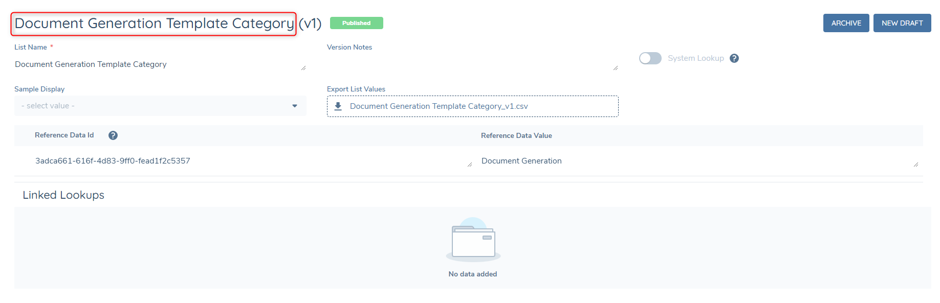
Create a Reference Data List with the name "Document Generation Template Category" and add in your chosen categories. This will become the list of categories that can be selected from the category dropdown in Template Configuration.
Naming Convention:
NOTE: The Naming Convention is now only applicable to historical templates prior to Document Generation Enhancements. The Component Library is the primary configuration space for datakey mappings for document generation now.
The naming convention is a global naming convention set that controls how datakeys appear as the display label seen on all generated documents. An example of this can be seen below. On the left the "firstName" datakey does not have a naming convention applied to it, whereas on the right it does, with the chosen label being "Given Name".

To begin configuring naming conventions, click on the Naming Convention link under Document Generation, which will direct you to the below page which will allow you to setup an initial draft of naming conventions.

Click on the "Create Naming Convention" button to create the initial version 1 Naming Convention Set and begin adding naming conventions. Click on the "Add" button to add your first naming convention.
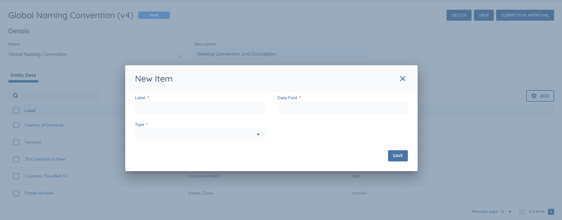
Choose the Label Name you would like to appear on a generated document, and then select the datakey for the label. Additionally, select the Type of field for the naming convention. If the type is Date or Number, then localisation formatting will be applicable on the field. For number fields this is the number separator and for date fields this is the date format.
The grid should now be updated to reflect the added naming convention. Click the Add button to add additional naming conventions and continue this process until the Set of naming conventions is completed.

Component Library:
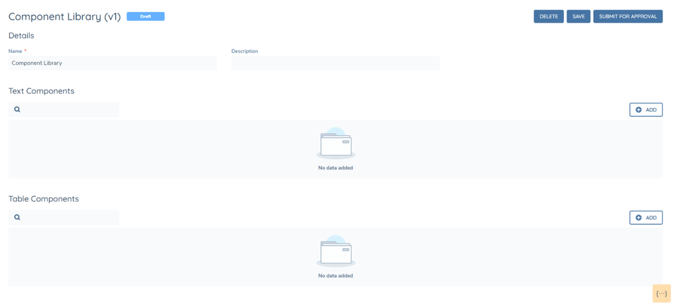
The component library is a collection of all the configured text and table components that can then be used as mappings within templates. To begin configuring components, click on the Component Library link under Document Generation, which will direct you to the below page which will allow you to setup an initial draft Component Library.

Once setup, it will be possible to add either text or table components. A text component should be used for mapping a single field, for example mapping "firstName". Whereas a table component should be used for repeating instances of data. For example, an "address" data group or to see all products related to the main entity.
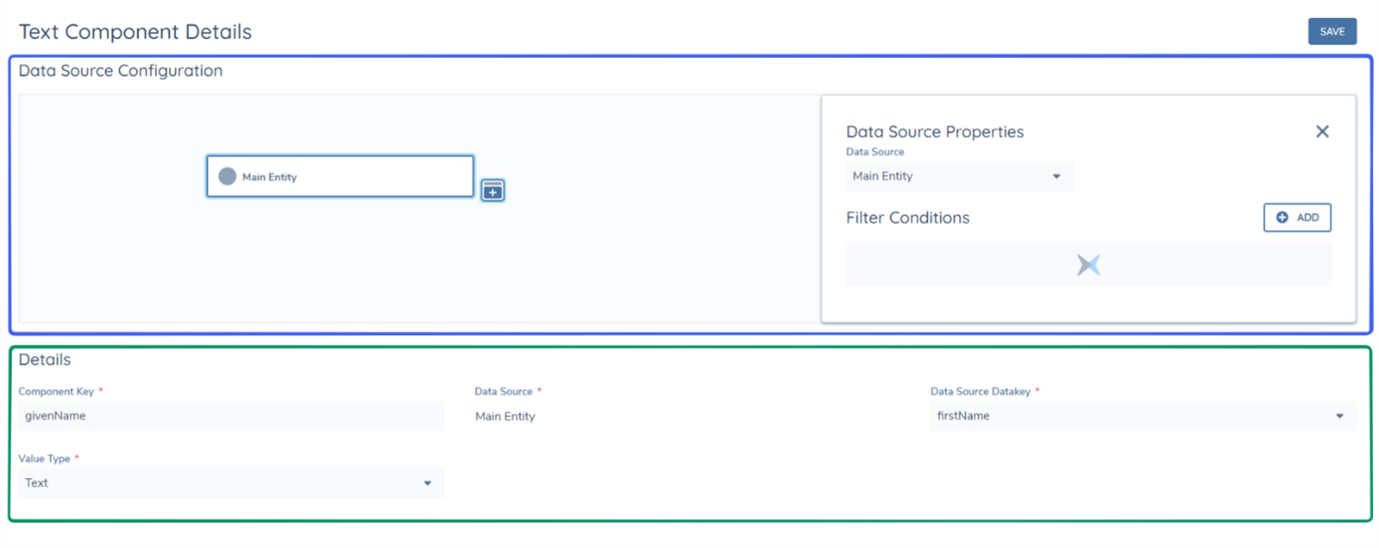
When creating a component, the first required step is selecting the data source that the component comes from. This is configured under the data source configuration section of the component (as seen below in Blue). After this, the datakey can be selected from the "Data Source Datakey" dropdown, the Component Key can be written and the Value Type can be selected (as seen in Green). The component key is the final mapping that needs to be inserted into the HTML Override file or into the Template Designer, for the mapping to be successful. The component key can be different to the datakey and does not have to be the same, as exampled below (givenName and firstName).
Text Components:
Text components are recommended to be configured primarily with the "Main Entity" data source, as only one value can be retrieved. To explain further, if a text component is configured with the data source "Related Products" using the data key "productType" but there are two related products of the main entity, the two values for "productType" cannot be retrieved in a single text component, due to this, it is recommended that in most circumstances, "Related" data sources are configured as Table components.
Text components can also have filter conditions applied to them IN the instance the datakey selected is from within a datagroup. For example, if there are multiple addresses in a datagroup, but only the postcode of a single address was desired to be mapped from the text component, it could be configured as shown below.
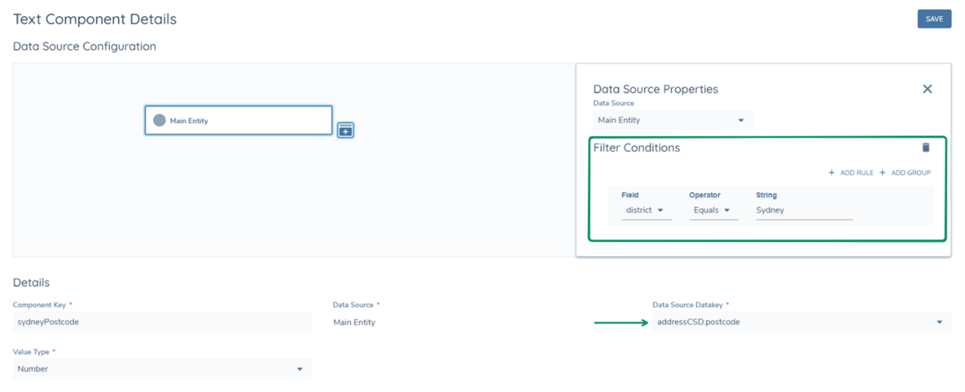
Datakeys within datagroups are available in the dropdown in the following format "datagroupdatakey.datakey". The datakey "postcode" of the datagroup "addressCSD" is seen in the format "addressCSD.postcode". This datakey can then be filtered with the condition, only give me the "addressCSD.postcode" datakey, when the district (addressCSD.district) is "Sydney".
Thus the text component will be able to retrieve the specific field. It is important to note that if the filtering condition returns 0 or more than 1 value, the text component will fail. This is why text components are recommended to be used when it can be guaranteed that only 1 instance of the datakey will be retrieved from the data source.
Text Components can also have the value type "Rich Text Editor" this is an enhancement to the Document Generation Feature which allows RTE field types in policy to be generated onto a PDF.
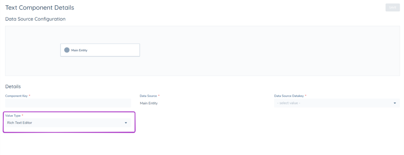
Table Components:
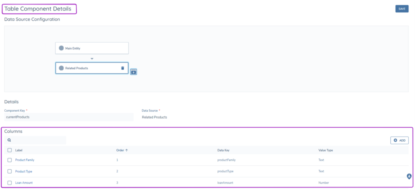
As mentioned above, table components are recommended to be used to display multiple datakeys in a table view. When creating a Table Component, Data Source configuration should be completed before adding the intended columns.
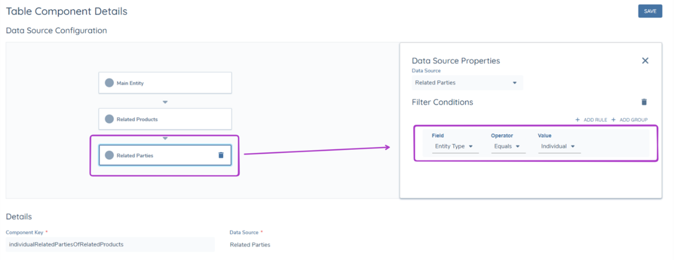
It is important to note that nested data sources are available for both component types. For example, a table can be made to display the Related Parties of Related Products, which would be configured as shown below. Additionally, filtering logic can be applied at different levels of a nested data source.
Filter on the 1st Nested Data Source Layer
This will make sure that only Products with the productType "Home Loan" are in scope for this table.
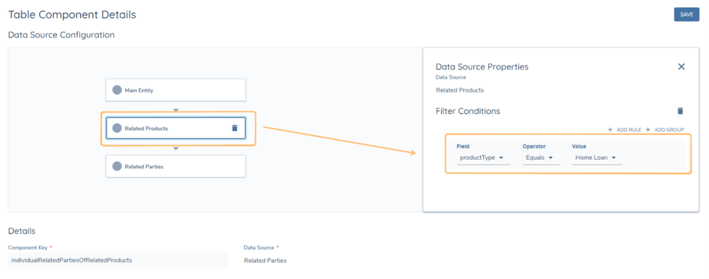
Filter on the 2nd Nested Data Source Layer
This will make sure that only Related Parties with the Entity Type of "Individual" of Home Loans with the productType "Home Loan" will be filtered into this table.
Once a datasource has been selected, simply add the desired datakeys as columns, whilst also selecting their Label, Order and Value Type. Datakeys within datagroups are also available to be added as columns in table components, they follow the same format "datagroupdatakey.datakey" as seen in text components. A Component Key is also required for all table components.
Loop Components:
To display data fields from nested data sources in the same format as entity data data fields, the user can leverage a loop component. The loop component is a collation of text and/or table components from a specific nested data source.
To explain further, using the previous example, if the user places the "productType" data key, as a text component, inside a looped component which has the data source "Related Products" then the looped component will generate the "productType" data key for as many products as there are linked to the main entity. This allows for the final appearance of nested component data in the generated document to present the same as entity data, rather than in a table.
To configure a loop component, follow these steps:
- Create a draft in the component library, or create new if one does not already exist.
- Click the ADD button next to Loop Components.
- Choose the data source, in this example "Related Products" is the chosen data source.
- Name the component key, in this example the component is called "productsLoop".
- Click save.
- When prompted, confirm component creation by clicking Confirm in the pop-up.
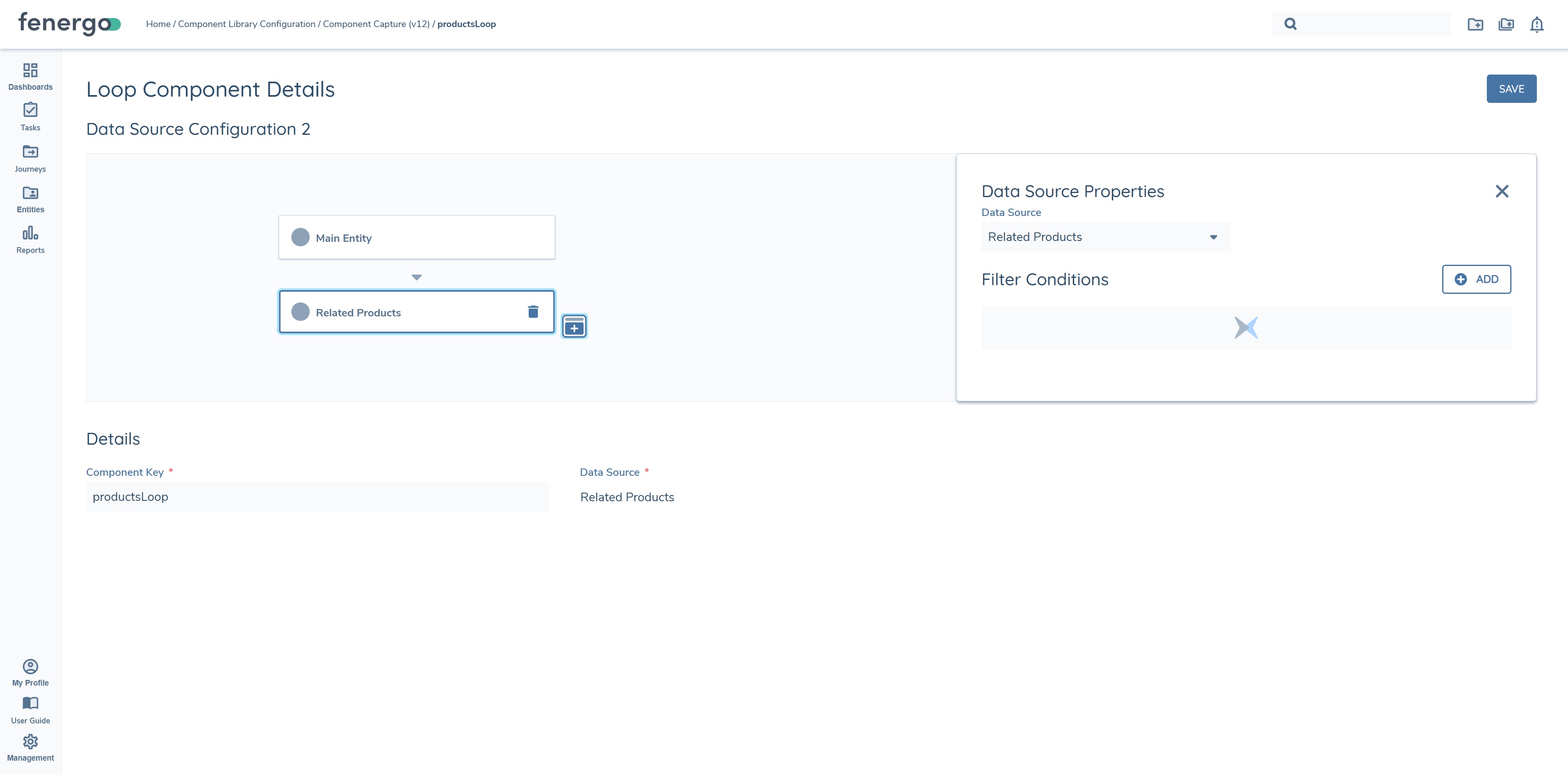
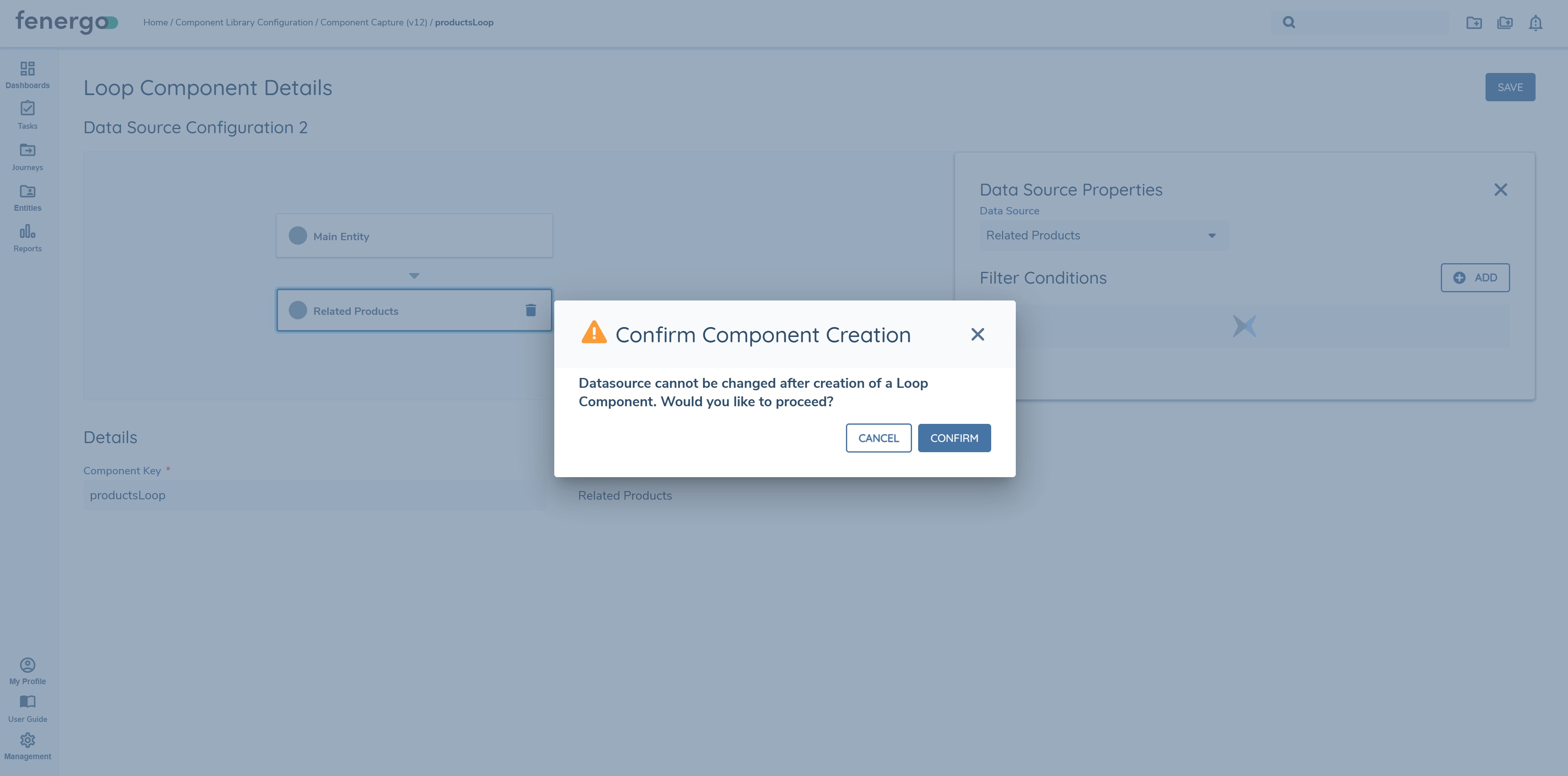
Once the steps above have been completed, the user can now configure both text and table components for the selected data source. If the data is required to be surfaced as text components only, configure each data key as a text component. In this example both text components and table components will be configured for demonstration purposes.
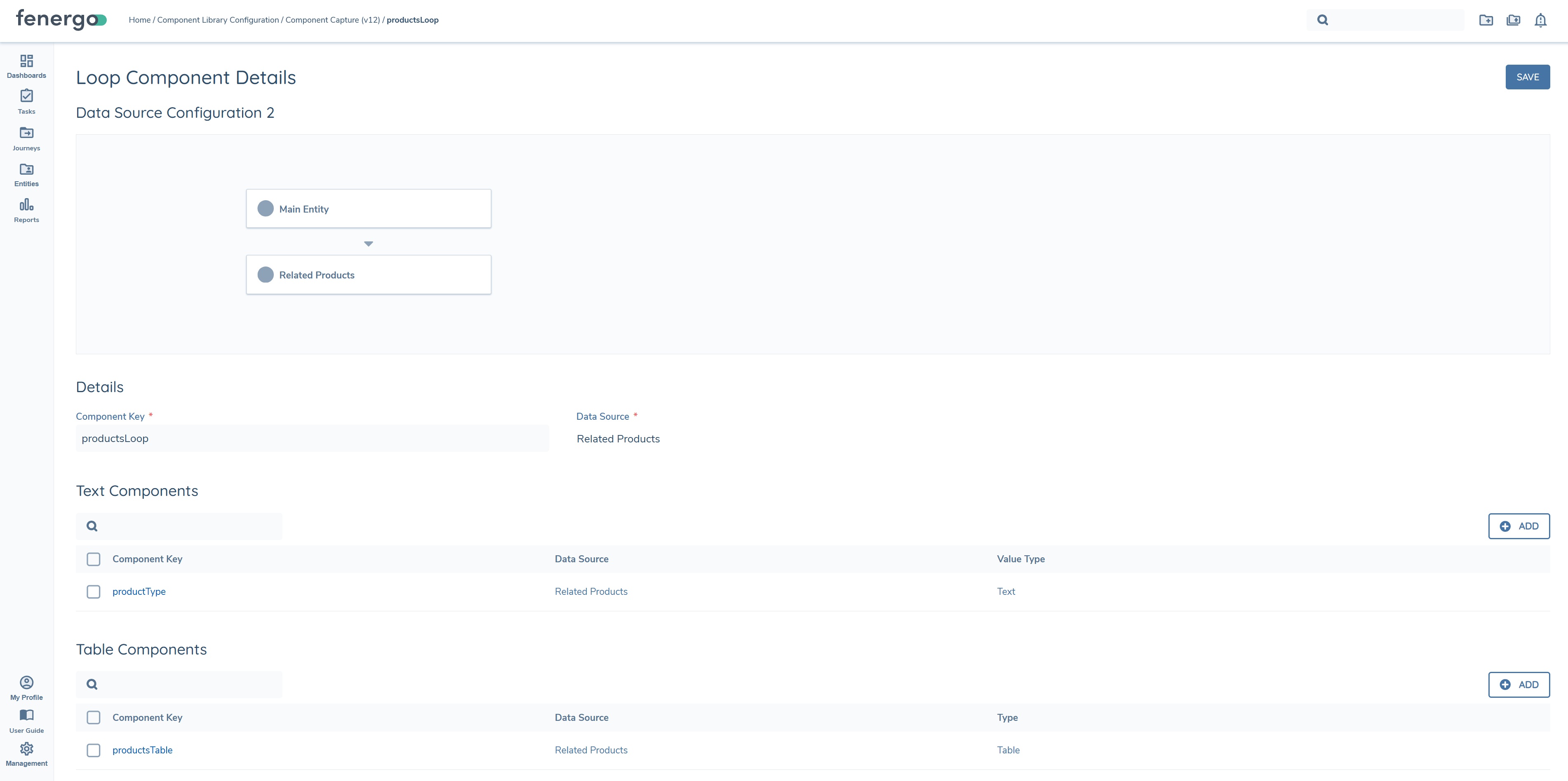
In the above example, one text component "productType" has been configured, along with one table component, "productsTable". Text and table components are configured within loop components as they are in standalone text/table components. To see the loop component in the generated document, add it to the document template.
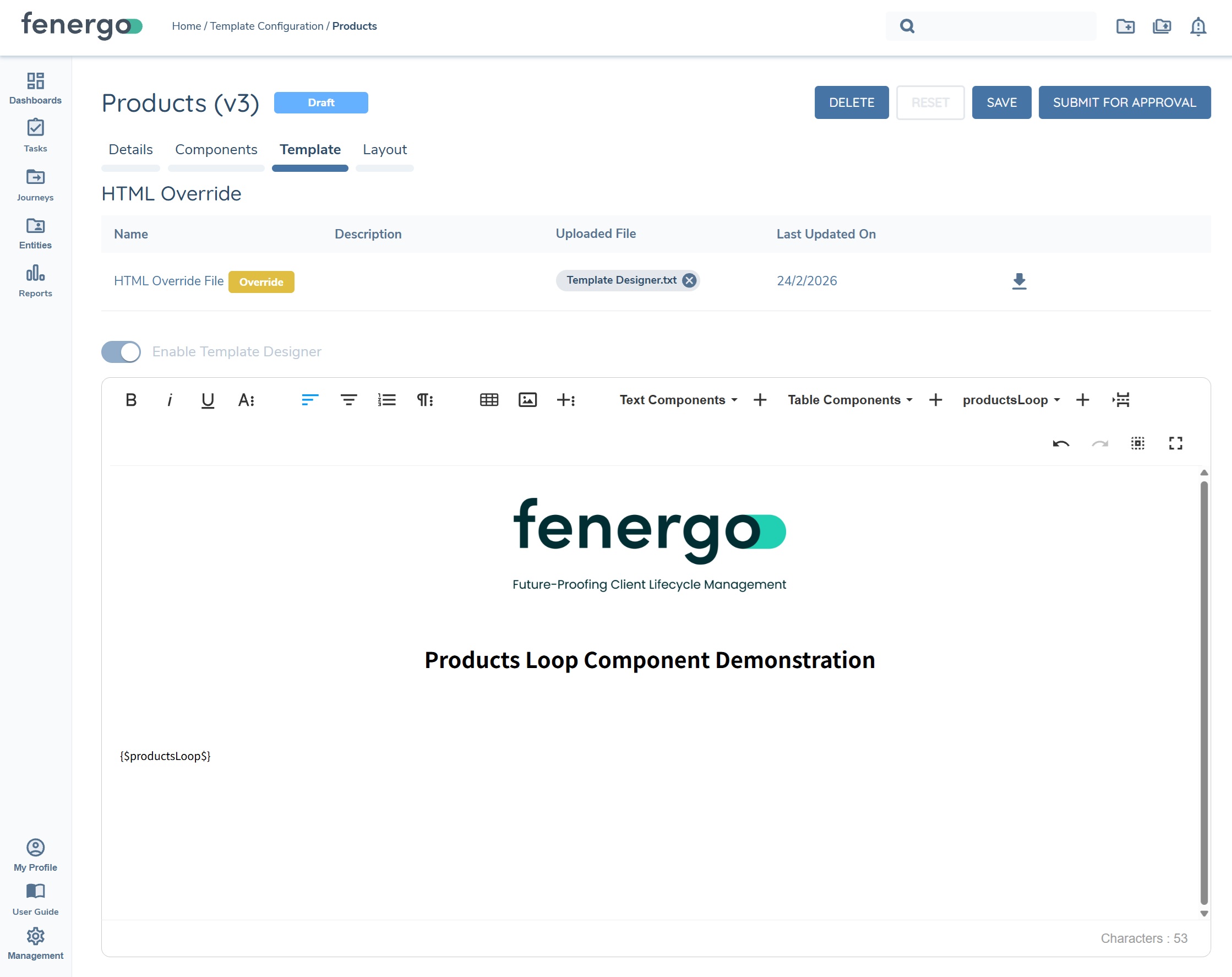
The resulting generated document surfaces "productType" as a text component along with the "productsTable" table component for each product captured against the entity, as you can see below.
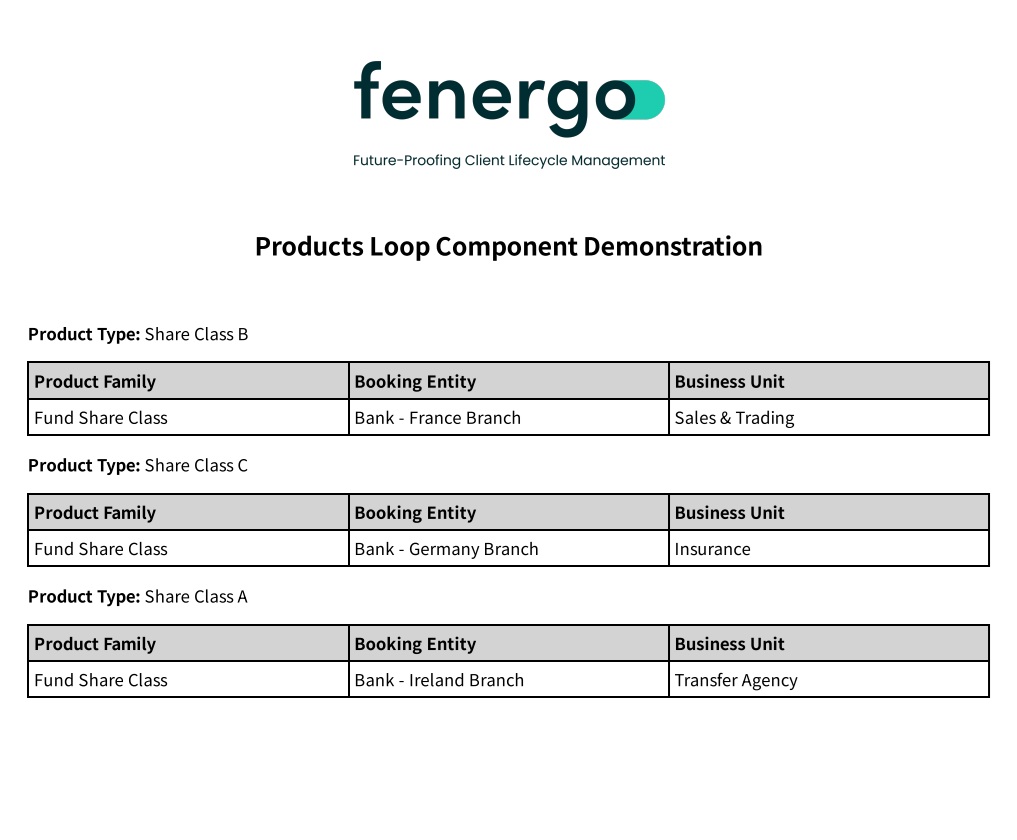
Looped components can only have one data source. Once this datasource is chosen it cannot be changed. All subsidiary data sources within a data source can be included inside a looped component. For example a "Related Products" Loop Component can have fields with the data source of "Related Parties of Related Products".
Journey Documents Data Source:
The Journey Documents data source, available under Main Entity, lists the documents uploaded against the entity during the current journey. It can be used by text, table, and loop components in the same way as any other data source.
- Journey Documents is selectable as a data source under Main Entity in Data Source Properties.
- The following data keys are available:
documentType,fileName,uploadedByUserName,uploadedOn,lastUpdatedBy,lastUpdatedOn. - Filter conditions on Journey Documents can be applied against any of these data keys — for example, filtering to a specific
documentType(with the value list drawn from the tenant's Acceptable Documents configuration), a specificuploadedByUserName, or a date range onuploadedOnorlastUpdatedOn. - A text component bound to one of these data keys renders that value for the matching journey document; a loop or table component produces one entry or row per document uploaded during the journey.
- If the entity has no documents in the journey, the field renders blank or the configured placeholder, consistent with the "render placeholder for empty values" template setting.
Risk Assessment Data Source:
The Risk Assessment data source, available under Main Entity, makes the outcome of a Risk Assessment task available to table components in a generated document.
- Risk Assessment is available as a data source for table components only; it is not available for text or loop components.
- The Automated Document Generation task must specify which Risk Assessment task in the journey schema its risk data comes from. This is set using the Risk Assessment Task dropdown on the Details tab of the task's properties, alongside Template Category.
- Each row in the resulting table represents a single node from the risk assessment — a risk factor group, a risk factor, or one of a risk factor's input values.
- Four columns are always present: Risk Factor Group, Risk Factor, Input Value, and Risk. Four further columns — Rating, Weight, Weighted, and Algorithm — can be added from the component library in any combination and order.
- The Risk column mirrors the rating label shown against the risk assessment in the journey, for example "Low 0" or "Medium 2". A node with no risk category renders "Not assessed".
- If the configured Risk Assessment task has not yet run, or its result is unavailable, the table renders empty rather than causing document generation to fail.
Filter conditions are not configurable for the Risk Assessment data source — the table always reflects the complete risk assessment result.
To style the Risk Assessment table independently of other tables in the template, see Example — Styling a single table component in the Template Styling Cheat Sheet.
Related Parties (All Levels) Data Source:
The Related Parties (All Levels) data source, available under Main Entity, returns the main entity's complete association graph — not just its direct related parties — for use in table and loop components.
- Available for table and loop components. It is not available for a standalone text component — the data source is not offered in the dropdown when configuring a text component outside a loop, and attempting to configure one against it is rejected with the error
RelatedPartiesAllLevelsDoesNotSupportTextComponents. A text component configured for a single field inside a loop component that uses this data source is supported, since it resolves once per loop iteration rather than needing to return a single value across the whole traversal. - Filter conditions are not configurable — the data source always returns the full traversal.
- The following fields are available:
level— how many steps the related party is from the main entity.path— the chain of relationships from the main entity down to this party.relationship— the relationship type for this step in the chain.relatedTo— the entity this party is directly attached to in the path (its parent in the chain), not the entity at the far end of the overall association.relatedParty— the name of the related party itself.ownershipPercentage— the party's direct ownership stake at this step only, not a look-through figure. A stake of zero renders blank rather than0.totalOwnership,totalControl,ultimateOwnership,ultimateControl— look-through percentages calculated across the full chain back to the main entity. These are available as configurable columns rather than always-present fields.- The normal entity policy fields (for example
entityType) are also available, in the same way as for the standard Related Parties data source.
- A table or loop component using this data source produces one row per association, not one row per party. A related party connected through more than one relationship, or appearing at more than one point in the chain, produces a separate row for each occurrence.
The existing Related Parties data source is unchanged and continues to return direct associations only. Use Related Parties (All Levels) where second-, third-, or further-level connections are required.
Important: The 2,000 related-party record limit described under Considerations is not a separate allowance per data source. It is a single, combined limit shared across the Related Parties, Related Parties (All Levels), and Investment Account Related Parties data sources — the total number of related-party records retrieved across all of them in one document generation cannot exceed 2,000.
Journey-Level Data in Components:
Data fields configured as Journey Level Data — captured against the journey's entity draft and not written back to the entity — are available for selection in the data key list when configuring a text component.
- Available for the main entity and for related parties.
- If the same data key exists both as an entity property and as journey-level data, the entity property value takes precedence, so existing documents are unaffected.
- An empty journey-level field behaves like any other empty field.
- Journey-level data groups are not yet supported — only single properties are available, so tables and loop components over a journey-level data group render empty.
See Working with Advanced Journeys — Journey Level Data for how Journey Level Data is configured.
Template Configuration:
This is where multiple different templates can be created and configured, each template can be used to meet different document generation use cases.
To begin, click on the Template Configuration link under Document Generation and create a new template, which will direct you to the below page.
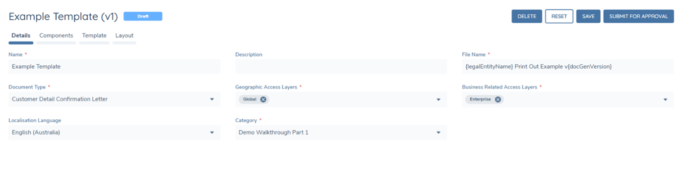
- Set the Template Name, this is the name of the configuration template.
- Set a description for the template if desired.
- Set the File Name for documents generated by the template. See File Naming & Document Versioning for More information.
- Set the Document Type (For more information refer to Document Type Configuration).
- Set the Business Related and Geographic Access Layers for all documents generated by the template.
- Set the Localisation Code to apply number separator and date format preferences for all Number and Date fields generated by the template. This setting now takes effect without requiring HTML changes. Text in languages with special characters, such as Chinese, Japanese, and Korean — including values sourced from external data providers — also renders correctly in generated documents.
- Select the category. This will read from the previously configured Reference Data List with the name "Document Generation Template Category"
Font Support for Special-Character Languages:
Rendering text correctly in a language with special characters — such as Chinese, Japanese, Korean, or Arabic — also depends on the template using a font that includes the characters for that language. If the template's font does not cover those characters, the text can appear blank or as placeholder boxes, even once the Localisation Code has been set.
To add a font that supports these characters, open Code View for the template (see More Options below) and add a web font stylesheet link alongside a font-family declaration that references it. For example, to support Simplified Chinese, Japanese, Korean, and Arabic using Google's Noto Sans fonts:
<link rel="preconnect" href="https://fonts.googleapis.com">
<link rel="preconnect" href="https://fonts.gstatic.com" crossorigin>
<link href="https://fonts.googleapis.com/css2?family=Noto+Sans+Arabic:wght@400;500;600;700&family=Noto+Sans+JP:wght@400;500;600;700&family=Noto+Sans+KR:wght@400;500;600;700&family=Noto+Sans+SC:wght@400;500;600;700&display=swap" rel="stylesheet">
<style>
  body {
    font-family: "Noto Sans SC", "Noto Sans JP", "Noto Sans KR", "Noto Sans Arabic", Arial, sans-serif;
  }
</style>
Replace the font families in the stylesheet link and the font-family declaration with whichever languages the template needs to support.
Layout:
The Layout tab in Template Configuration includes a Page Border toggle. When enabled, the PDF renderer wraps each page of the generated document with a solid border.
Dynamic File Naming & Document Versioning:
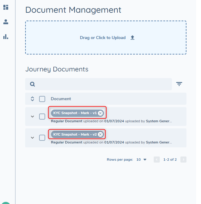
Datakeys from Entity Data can be used within the File Name field of a template. Add in the desired datakey inbetween an opening and closing brace, multiple datakeys can be used.
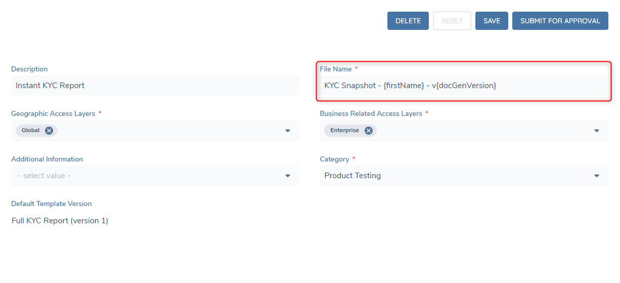
There is a reserved datakey "docGenVersion" this datakey is a number that will increase every time the template generates a document within the context of a journey. Below is an example of the final result of the above configuration.
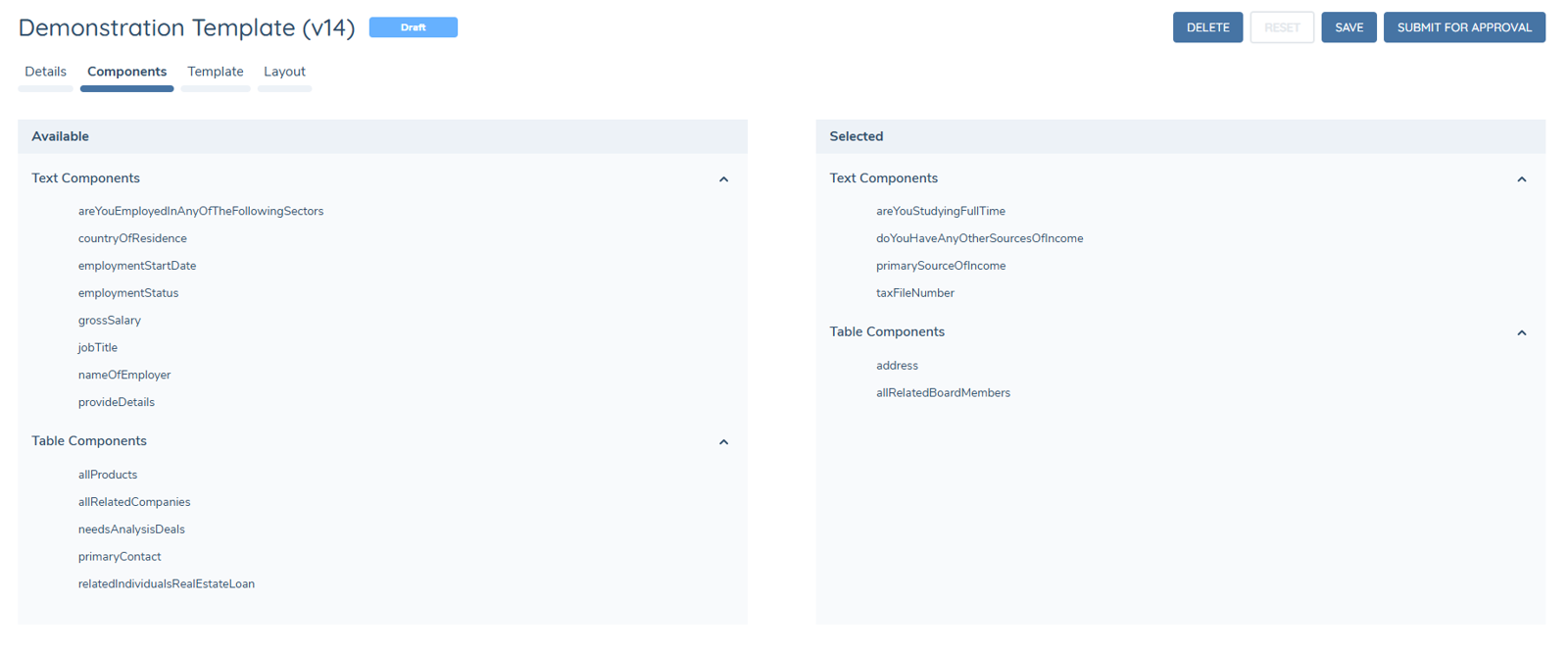
Components:
- Select components published in the component library (left-hand "Available" side) to be used in the template (right-hand "Selected" side).
- Every row in both panels carries a checkbox; the arrow buttons move all ticked components at once.
- Each panel has a Select All option, which acts on the rows the current filter leaves visible; its counter reports the whole panel, so a tick hidden by a filter is never lost from view.
- A selection can be built across several filters without earlier ticks being lost.
- A selection is capped at 200 components. Beyond the cap, Select All and unticked rows are disabled and the limit is shown next to the counter.
- Adding a component removes any component already in the template under the same component key, so a key is never present twice.
- Published components remain available on the left-hand side for all templates, and can be added to or removed from various templates as desired.
- If a component is updated and republished with changed configuration, it must be removed and re-added to any existing templates to pick up that configuration.
- Once the desired components have been added into the template, progress to the next tab.
Template:
There are two available configuration options available to apply the styling, branding and mappings into the generated PDF.
- HTML Override
- Template Designer.
HTML Override:
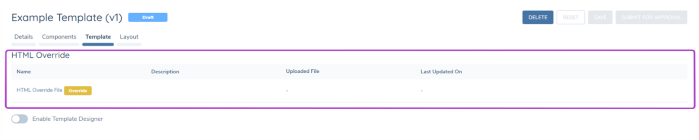
HTML Override: The HTML override upload allows for a custom HTML file to be uploaded to a template. This allows for custom styling and branding of a template, datakeys can also be mapped into the HTML to create highly customised templates for specific business purposes. The HTML file uploaded must be a .txt file, and the supported syntax is Razor or basic HTML syntax.
Template Designer:
The Template Designer is a no-code sandbox style tool to generate templates for document generation. Once the "Enable Template Designer" switch has been turned on. The components that have been added to the template on the previous tab, will appear available as mappings that can be inserted into the template.
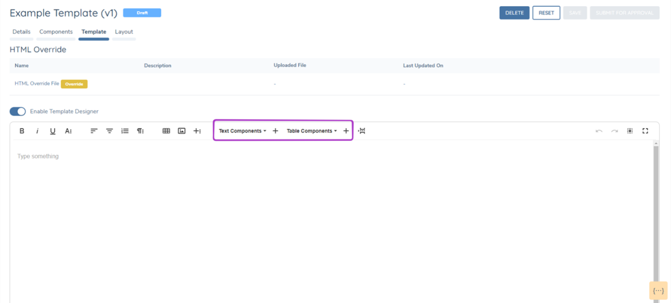
Static text, static tables and images can all be added into the template designer to create a custom template design, without the need to write the code for a HTML override file.
Once editing within the template designer has been completed, simply press save, which will save the content of the Template Designer into the HTML Override file. This file can then be downloaded, edited if desired and reuploaded.
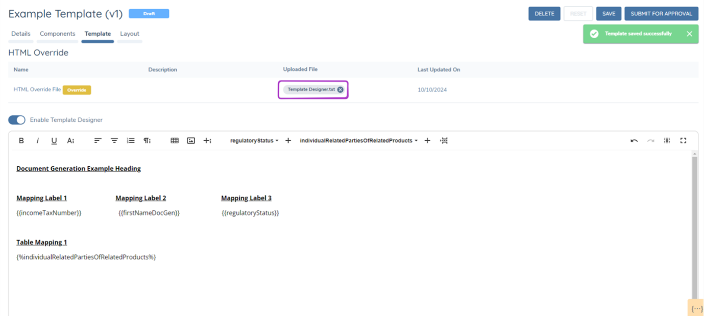
When an HTML override file is in use, the Template Designer will automatically deactivate. To reactivate the Template Designer, you must remove the uploaded HTML override file.

To revert to an HTML override file from the Template Designer, first delete the Template Designer.txt file. Then, disable the Template Designer.
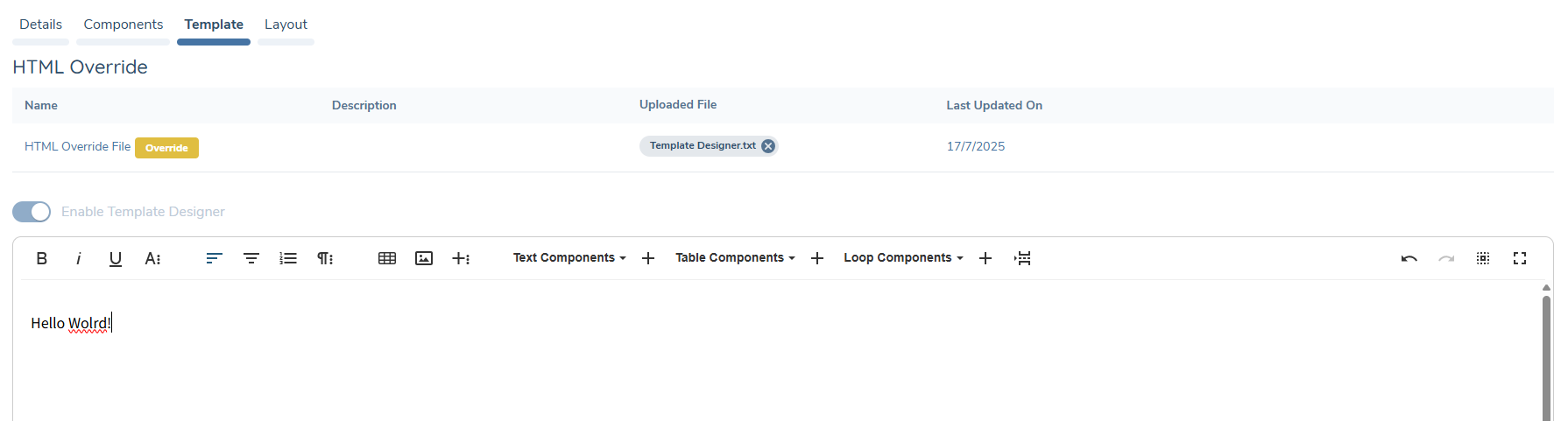
Empty Field Placeholder:
A Show "-" for empty fields toggle sits alongside the Enable Template Designer switch in the Template tab.
- When enabled, a text component or table cell that resolves to no value (empty, absent, or whitespace-only) renders
-in the generated document instead of appearing blank. - Applies to text components and table cells. Loop and table row generation are otherwise unaffected — this only changes how an individual empty value is displayed.
- When disabled, empty values render blank as before.
Template Designer — Enhanced Editing Capabilities:
The Template Designer includes a set of enhanced editing capabilities designed to reduce configuration effort during template authoring:
- Inline token insertion — type
{{anywhere in the editor to trigger a searchable autocomplete dropdown of available data keys. Select the desired key to insert it at the cursor position. Type{%to insert a loop component using the same autocomplete mechanism. This allows token and loop insertion directly from the keyboard without navigating the toolbar. - Auto-save — the editor automatically saves a draft of the template every 60 seconds in the background. Auto-save does not change the template's state and does not trigger the approval workflow — it operates silently to preserve work between explicit saves.
- Drag-and-drop reordering — supported block content elements can be repositioned within the editor by dragging them to a new location, removing the need for cut-and-paste when restructuring templates.
- Alphabetical component sorting — text, table, and loop component dropdowns are sorted alphabetically by component key, making lookup predictable regardless of the size of the component library.
- Code beautifier — when switching to code view, the editor formats the HTML with consistent indentation and line breaks, making code view a practical inspection and editing surface.
- Extended toolbar — the editor toolbar now includes find and replace, special character insertion, a live word and character count, print preview, and an inline keyboard shortcuts reference panel.
- Quick Insert — a contextual
+button appears in the editor left margin when the cursor is on an empty line. Clicking it provides a shortcut for inserting block elements without scrolling to the toolbar. - Word content paste — pasting content copied from a Word document directly into the editor preserves formatting when the source document contains page breaks, rather than disrupting the editor.
Token Highlighting, Tooltip & Validation Warning:
Tokens in the editor are underlined to show whether they will resolve when the document is generated.
- A token bound to a valid data key is underlined in teal.
- A token with no matching data key is underlined in red.
- Hovering a token shows a tooltip. For a valid token, the tooltip shows its type, component key, value type, and data source. For an invalid token, the tooltip states that no matching key was found.
- When one or more invalid tokens are present, a warning banner is displayed at the bottom of the editor listing each affected token, for example: "These tokens don't match a component of the right type and won't render correctly. Fix or remove them before publishing."
- This gives immediate feedback on a mistyped or misspelled token, rather than only discovering it when a document is generated.
More Options:
A ⋯ (more options) icon at the top right of the editor toolbar reveals a second row of icons for further actions, including Full Screen, Print, Download to PDF, Import from Word, Export to Word, and Code View.

- Import from Word converts an uploaded
.docxfile into editable content within the template editor, letting a template be drafted in Word — using existing branded document templates, styles, and formatting — and brought straight into Document Generation instead of being rebuilt by hand. This can massively speed up template creation, especially for long or heavily formatted documents. Formatting is preserved even when the source document contains page breaks. - Export to Word downloads the current template content as a
.docxfile. - Download to PDF and Print produce a PDF or print-ready view of the current template content.
- Code View switches the editor to the underlying HTML, as described above under Template Designer — Enhanced Editing Capabilities.
Preview:
A Preview button is available in the Template tab once the template version has been saved. Clicking Preview opens the rendered template as HTML in a new browser tab, without running a journey or generating a PDF.
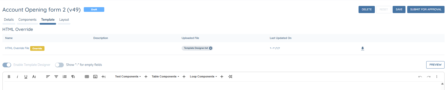
- Preview renders the template using representative sample data, not real entity data. Every loop and table renders with sample rows, and empty fields show readable sample values appropriate to the component's value type.
- If a render fails, Preview shows a readable message instead of a raw error.
Preview saves configurators from having to build a test case and run a full journey, or retrigger a document generation task, just to check what a template will produce.
Syntax:
Syntax across both HTML Override and Template Designer template types have a new and simplified syntax. The syntax comes in three formats, depending on the component type

No-Code Conditional Logic
Text, table, and loop components can be marked as hide-when-empty directly within Template Configuration, without writing HTML. When a component's underlying data has no value, the component — and, for table and loop components, its surrounding row or section — is not rendered in the generated document.
- Conditional logic is available for text, table, and loop components.
- To apply it, add a
?immediately before the component's closing tag. No other configuration is required — the same?convention is used regardless of component type. - Configured conditions are honoured at document generation time.
- This covers the common case of hiding a field or section when it has no value. For more complex conditional logic, the HTML Override approach described below remains available.
| Component type | Syntax without conditional logic | Syntax with conditional logic |
|---|---|---|
| Text | {{firstName}} | {{firstName?}} |
| Table | {%relatedProductsTable%} | {%relatedProductsTable?%} |
| Loop | {$productsLoop$} | {$productsLoop?$} |
Adding ? to a text component hides that field (and its label) when the underlying value is empty. Adding ? to a table or loop component hides the whole table or loop — including its surrounding row or section — when there is no data to populate it.
HTML Specific Syntax***
In the instance that specific use cases would like to be achieved by the PDF output such as:
- Hiding content relative to a field when a field is returned blank.
- Repeating instances of content.
HTML specific syntax can be written into the HTML override file. It is important to note that once HTML specific syntax is written into an override file it WILL NOT be compatible with the template designer. Examples are included below.
Hiding HTML Content:
    @if(Model.TextComponents["componentKey"] != null &&
    Model.TextComponents["componentKey"] != "") { Label Heading {{componentKey}} }
Repeating HTML:
Content @foreach(var row in Model.TableComponents["componentKey"].Rows) {
    Label Heading @row.Cells["componentKey"].FirstValue
    Label Heading  @row.Cells["componentKey"].FirstValue
}
Template Styling Cheat Sheet
For security reasons, only SVG images — or images embedded directly as a base64-encoded data URI — can be used in a template. Other raster image formats (such as PNG or JPG) cannot be uploaded, and image files that represent simple shapes, such as squares, boxes, or divider lines, are blocked outright. These effects, and several other frequently requested layout patterns, can be recreated directly in HTML and CSS within the HTML Override rather than as an image. This section collects worked examples for the most common cases.
A sample HTML file demonstrating every pattern in this section together is available for download: Document Generation styling sample. It can be opened directly in a browser — including its browser Print Preview, to see the repeating header, footer, and page-break behaviours — and used as a starting reference when building a new HTML Override.
HTML Override templates use Razor syntax. Any literal @ character in the template — including in CSS rules such as @media or @page, or in plain text such as an email address — must be written as @@, or the template fails to compile with an error such as CS0103: The name 'media' does not exist in the current context.
Example — Styling an underline:
.underlined-text {
    text-decoration: underline;
    text-decoration-color: #000000;
    text-decoration-thickness: 1px;
}
<span class="underlined-text">Signature</span>
Example — Recreating a divider line or block without an image:
<table style="width: 100%; border-collapse: collapse;">
<tr>
<td style="border-bottom: 1px solid #000000; padding: 0; line-height: 1px;"> </td>
</tr>
</table>
The same approach — a table cell with no visible border except where a line is wanted, and a background colour set with CSS — can be used to reproduce a solid square or box.
Example — Repeating a logo or heading on every page:
Wrapping the whole document body in a single table and placing a repeating element in an HTML <thead> causes that element to repeat automatically at the top of every printed page, since this is standard table behaviour rather than a special feature of the renderer.
.page-layout-table, .page-layout-table > tbody, .page-layout-table > tbody > tr, .page-content-cell {
    display: contents;
}
.page-running-header { display: none; }

@@media print {
    .page-layout-table { display: table; width: 100%; border-collapse: collapse; }
    .page-running-header { display: table-header-group; }
    .page-header-cell { text-align: center; padding: 4mm 0 6mm; }
    .page-content-cell { display: table-cell; vertical-align: top; }
}
<table class="page-layout-table">
  <thead class="page-running-header">
    <tr><td class="page-header-cell">
      <img src="data:image/png;base64,...." alt="Company logo" style="height: 20mm;" />
    </td></tr>
  </thead>
  <tbody>
    <tr><td class="page-content-cell">
      <!-- rest of the document -->
    </td></tr>
  </tbody>
</table>
The display: contents rule keeps the table invisible on screen, in Preview, and in the Template Designer, so the structure only takes effect once the document is printed to PDF.
Example — Repeating footer text on every page:
The same approach applies to a footer using <tfoot> with display: table-footer-group in place of <thead>:
.page-running-footer { display: none; }

@@media print {
    .page-running-footer { display: table-footer-group; }
    .page-footer-cell { border-top: 1px solid #000; padding-top: 4pt; }
    .page-footer-row { display: flex; justify-content: space-between; font-size: 9px; }
}
<tfoot class="page-running-footer">
  <tr><td class="page-footer-cell">
    <div class="page-footer-row">
      <span>Document title</span>
      <span>Company name</span>
    </div>
  </td></tr>
</tfoot>
This repeats static text — a document title, a fund or entity name — on every page reliably. It cannot add an automatically incrementing page number ("Page 2 of 10"); that would require full CSS Paged Media support (@page margin boxes with counter(page)), which the current PDF rendering engine does not implement.
Example — Binding a text value to a checkbox:
There is no native checkbox component. A checkbox is a plain <input type="checkbox"> with the checked attribute added conditionally, based on comparing the resolved value of a text component against the expected option:
@{
    var value = Model.TextComponents["isAccreditedInvestor"].ToString();
    var isYes = string.Equals(value, "Yes", StringComparison.OrdinalIgnoreCase);
    var isNo  = string.Equals(value, "No", StringComparison.OrdinalIgnoreCase);
}
<input type="checkbox" @@(isYes ? "checked" : "") /> Yes
<input type="checkbox" @@(isNo ? "checked" : "") /> No
Example — Binding a multi-select list to several checkboxes:
When one datakey holds several selections in a single delimited string (for example "Employment,Inheritance,Sale of Asset"), split it once into a list and test membership for each checkbox, rather than repeating comparison logic for every option:
@{
    var raw = Model.TextComponents["sourceOfFunds"].ToString();
    var selected = raw.Split(',').Select(s => s.Trim()).Where(s => !string.IsNullOrWhiteSpace(s)).ToList();
    bool IsSelected(string option) => selected.Any(s => string.Equals(s, option, StringComparison.OrdinalIgnoreCase));
}
<input type="checkbox" @@(IsSelected("Employment") ? "checked" : "") /> Employment
<input type="checkbox" @@(IsSelected("Inheritance") ? "checked" : "") /> Inheritance / Gift
<input type="checkbox" @@(IsSelected("Sale of Asset") ? "checked" : "") /> Sale of Company / Asset
Example — Laying out paired checkbox options in two columns:
A CSS grid keeps two columns of checkbox options aligned even when the option labels are different lengths:
.checkbox-grid {
    display: grid;
    grid-template-columns: 1fr 1fr;
    column-gap: 24px;
    row-gap: 6px;
}
.checkbox-grid .option { display: flex; align-items: flex-start; }
.checkbox-grid .option input[type="checkbox"] { margin-right: 6px; margin-top: 2px; }
<div class="checkbox-grid">
    <label class="option"><input type="checkbox" /> Option A</label>
    <label class="option"><input type="checkbox" /> Option B</label>
    <label class="option"><input type="checkbox" /> Option C</label>
    <label class="option"><input type="checkbox" /> Option D</label>
</div>
Example — Adding a fill-in blank line for a value:
A run of typed underscore characters is not a reliable way to represent a blank line — the underscore glyph renders inconsistently across fonts and can wrap unpredictably at a page boundary. A border-bottom on an element sized to fill the available space is more consistent:
.fill-form { width: 100%; border-collapse: collapse; table-layout: fixed; }
.fill-form td { padding: 6px 0; vertical-align: bottom; }
.fill-label { width: 32%; white-space: nowrap; padding-right: 8px; }
.fill-blank { border-bottom: 1px solid #000; height: 1em; }
<table class="fill-form">
  <tr><td class="fill-label">Field label:</td><td class="fill-blank"></td></tr>
</table>
For a blank inside a single line of text rather than a table row:
.fill-line { display: flex; align-items: baseline; }
.fill-line .fill-label-inline { flex-shrink: 0; margin-right: 6px; white-space: nowrap; }
.fill-line .fill-blank-inline { flex-grow: 1; border-bottom: 1px solid #000; height: 1em; }
<p class="fill-line">
  <span class="fill-label-inline">Field label:</span>
  <span class="fill-blank-inline"></span>
</p>
For a blank sitting mid-sentence, a fixed-width inline-block avoids the wrapping issue without needing a full-width line:
.inline-blank { display: inline-block; min-width: 120px; border-bottom: 1px solid #000; height: 1em; vertical-align: bottom; }
<p>In the amount of U.S. $<span class="inline-blank"></span> for the specified number of shares.</p>
Example — A signature line with a printed name caption:
Some layouts put the blank line first and the caption underneath it, rather than a label before a blank:
.sig-line-block .sig-rule { border-bottom: 1px solid #000; height: 1.6em; }
.sig-line-block .sig-caption { font-size: 11px; margin-top: 2px; }
<div class="sig-line-block">
  <div class="sig-rule"></div>
  <div class="sig-caption">Print name of signatory</div>
</div>
Example — Hiding a blank or placeholder value without removing the surrounding layout:
The no-code hide-when-empty ? syntax and the Show "-" for empty fields toggle, described above, cover the common cases of an empty field. Where a value must be treated as blank for a reason those options do not cover — for example, when upstream data returns a literal placeholder character such as a dash to mean "no answer" — normalise it once in a shared helper rather than repeating the check at every usage:
@{
    bool IsBlankOrPlaceholder(string value) {
        if (string.IsNullOrWhiteSpace(value)) return true;
        var trimmed = value.Trim();
        return trimmed == "-" || trimmed == "–" || trimmed == "—";
    }
}
Routing every value lookup through a helper of this kind keeps labels and table structure in place while ensuring the value itself renders empty when there is nothing meaningful to show.
To hide a single cell without disturbing a table's column layout, visibility: hidden removes the visible content while still reserving its space:
.empty-value-cell { visibility: hidden; }
Example — Styling a single table component:
A table component, such as a Risk Assessment table inserted with {%RiskAssessment%}, renders as a standard HTML table. To style one table without affecting any other table in the template, place the component token inside a wrapper <div> with its own class, and prefix every CSS rule with that class:
.risk-table table { width: 100%; border-collapse: collapse; font-family: Arial, Helvetica, sans-serif; font-size: 12px; border: 1px solid #D9DEE7; }
.risk-table th { background: #1F2A44; color: #FFFFFF; text-align: left; padding: 8px 10px; border-bottom: 3px solid #3B82F6; }
.risk-table td { padding: 7px 10px; border-top: 1px solid #E5E9F0; vertical-align: top; }
.risk-table tr:nth-child(even) td { background: #FAFBFD; }
.risk-table th:nth-child(n+5), .risk-table td:nth-child(n+5) { text-align: center; width: 9%; }
.risk-table td:first-child:not(:empty) { font-weight: bold; background: #EEF3FB; border-left: 4px solid #3B82F6; }
<p>Risk Assessment</p>
<div class="risk-table">
  {%RiskAssessment%}
</div>
- The component token must not sit inside a
<p>element. A table inside a paragraph is invalid HTML and can be moved outside the wrapper when the template is saved or rendered, so the scoped styles no longer apply. - The wrapper is best added in Code View. After saving, check in Code View that the
classattribute has been kept. If it has been removed, anidcan be used instead (<div id="risk-table">, with#risk-tablein place of.risk-tablein each CSS rule). - The
:not(:empty)rule highlights the Risk Factor Group rows of a Risk Assessment table, because only group rows populate the first column. When Show "-" for empty fields is enabled, empty cells contain-, so this rule highlights every row and should be removed. - The
nth-childcolumn rules depend on the column order configured for the table component in the Component Library. - CSS cannot style a cell based on its value, for example colouring "Low" and "Medium" risk differently. That requires building the table row by row with the Repeating HTML syntax described above, which is not compatible with the Template Designer.
Example — Keeping content together across a page break:
table, tr, .keep-together { page-break-inside: avoid; break-inside: avoid; }
.force-new-page { page-break-before: always; break-before: page; }
page-break-inside: avoid prevents a block such as a signature box or table row from splitting across two pages. It cannot guarantee where the block lands if it is taller than a full page — keep repeating blocks (such as payment or signature tables) short enough to fit comfortably within a page.
Example — Footnotes:
There is no support for a true page-anchored footnote that automatically follows its reference to the bottom of whichever page it lands on. The practical alternative is to place the footnote text manually in the normal document flow immediately after the section it belongs to, styled to look like a footnote:
.footnote { font-size: 11px; text-align: justify; text-indent: -18pt; page-break-inside: avoid; }
<p class="footnote"><sup>1</sup> Footnote text goes here.</p>
Because the note is pinned to a point in the flow rather than to the bottom of a page, a change to upstream data that shortens or lengthens preceding content can shift the footnote onto a different page from its reference. Layout should be re-checked whenever the datakeys feeding that section change.
Example — Multi-level clause numbering:
For legal or compliance-style clause numbering (1. then (a) then i.), an explicit negative text-indent matching each level's own left margin keeps the marker hanging to the left of the text, so wrapped lines align under the text rather than the marker — this is more reliable to control than nested list auto-numbering:
.clause-1 { margin: 10px 0 10px 20px; text-indent: -20px; text-align: justify; }
.clause-a { margin: 8px 0 8px 40px; text-indent: -20px; text-align: justify; }
.clause-i { margin: 6px 0 6px 60px; text-indent: -20px; text-align: justify; }
<p class="clause-1">1. First-level clause text.</p>
<p class="clause-a">(a) Second-level clause text.</p>
<p class="clause-i">i. Third-level clause text.</p>
Adding DocuSign Signature Fields
If a generated document will be sent for signing through the eSignature Documents task, the template must contain DocuSign anchor tags to mark where each signing field should be placed. DocuSign scans the generated PDF for these tags and replaces each one with the corresponding signing field.
Add the anchor tags to the template at the point where the signature block should appear:
<p>Signature: <span class="ds-tag">\s1\</span></p>
<p>Print name: <span class="ds-tag">\n1\</span></p>
<p>Initials: <span class="ds-tag">\i1\</span></p>
<p>Date: <span class="ds-tag">\d1\</span></p>
The numeral in each tag identifies the recipient, and corresponds to the Send Order set against that recipient when the envelope is sent. Use \s1\ for the first recipient, \s2\ for the second, and so on, repeating the block for each recipient who is required to sign.
The tags must be styled so that they do not appear on the finished document. Add the following to the style section of the template:
.ds-tag {
    color: #fff;
    font-size: 12pt;
    font-family: Helvetica, Arial, sans-serif;
    white-space: nowrap;
}
Each declaration serves a purpose:
color: #fffrenders the tag in white so that it is not visible against the white page, while remaining readable by DocuSign. If the signature block sits on a coloured or shaded background, set the colour to match that background instead.white-space: nowrapprevents the tag from being split across two lines. DocuSign matches the tag on exact text, so a tag that wraps will not be detected.font-size: 12ptkeeps the tag compact enough to remain on a single line within the signature block.font-familyis set to a plain sans-serif face so that the tag characters, including the backslashes, are reproduced without substitution.
Adding the anchor tags to the template is only half of the configuration. Each tag also requires a matching shared Document Custom Field in the DocuSign account. Without it, the tag will be present in the generated document but no signing field will be created on the envelope. See the Signing Field Anchor Tags section of the eSignature guide for the DocuSign portal steps.
Journey Configuration:
Configure the Automated Document Generation task into a Journey Schema using Journey Builder.
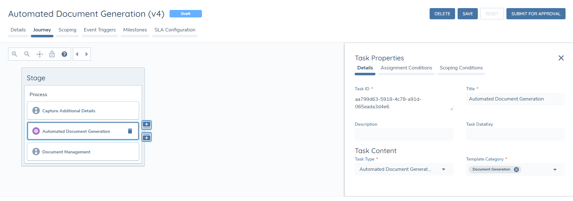
You may configure many instances of the Automated Document Generation task in your journey. Configuration of each instance of the task requires template(s) to be selected in the Template Category dropdown.
Enable Versioning:
Opening the Task Properties panel for an Automated Document Generation task shows an Enable Versioning toggle on the Details tab, alongside Task Type and Template Category. The toggle is disabled by default.
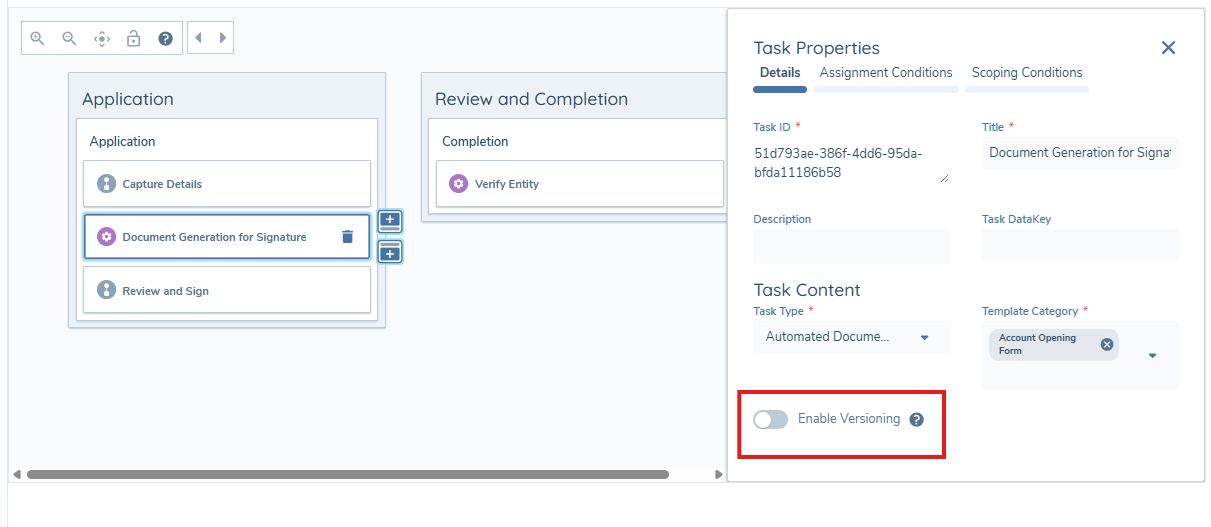
- When disabled, document generation always uses the latest published version of the template.
- When enabled, a journey uses the template version that was current when the journey started, even if the template is subsequently updated. This keeps documents generated mid-journey consistent with what was agreed when the journey began.
Enabling versioning does not affect journeys already in progress at the time it is turned on — the setting applies to journeys started after it is enabled.
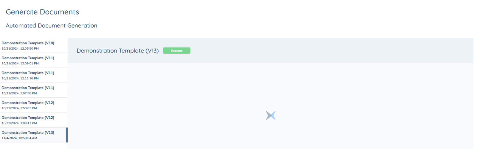
The Automated Document Generation Task now has a UI, and the task can be clicked on within a journey to see if template(s) have successfully or unsuccessfully generated a PDF.
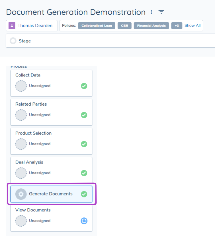
This enhancement has been introduced to ensure in the instance templates are unsuccessful in generating a PDF, troubleshooting is much easier.
After an Automated Document Generation task has completed, the file(s) generated are stored in Amazon S3. From there the documents are then retrieved to be visible on the UI in the following areas:
- Under Journey Documents within a DocumentsV2 Task.
- On the Entity Profile Page on the Documents Component.
- On the Entity Profile Page under the Documents Tab.
Generated Documents & Document Management
All generated documents that appear in a DocumentsV2 Task will state they have been uploaded by "System Generated".
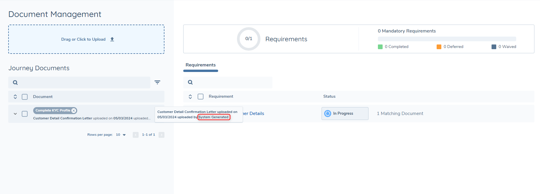
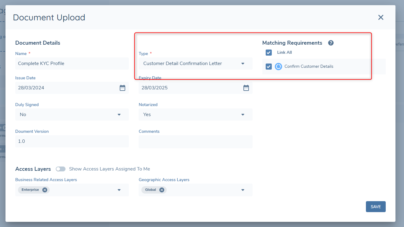
From the Journey Documents section, generated documents can be used in the same way an uploaded document would be.
If the Document Type that was configured in the template for the generated document can be used as an Acceptable Document for a Document Requirement, then generated documents can also fulfill document requirements.
Considerations
- Any public link to an image or logo will work in a Custom HTML file and will generate the image onto the PDF.
- Only SVG images, or images embedded as a base64-encoded data URI, can be used in a template. Other raster image formats, and image files representing simple shapes such as squares or lines, are blocked for security reasons — see the Template Styling Cheat Sheet for how to recreate these effects using HTML and CSS instead.
- The Related Parties data source returns only direct related parties of the main entity. To include related parties at any depth — second-, third-, and further-level connections — use the Related Parties (All Levels) data source instead. This data source is available for table and loop components only; a standalone text component cannot be configured against it.
- The Automated Document Generation Task supports up to 2,000 related-party records per document generation. This limit is shared, not applied per data source — it is the combined total retrieved across the Related Parties, Related Parties (All Levels), and Investment Account Related Parties data sources together, not a separate 2,000 allowance for each. When the combined count exceeds 2,000, the task continues and generates a document using the first 2,000 records. A warning is displayed indicating the actual count and the applied limit.
- The Automated Document Generation Task supports Related Products Data for entities with up to 1,000 related products. When the count exceeds 1,000, the task continues and generates a document using the first 1,000 related products. A warning is displayed indicating the actual count and the applied limit.
- When a Template Configuration containing a Loop Component Template is imported into another tenant using Configuration Exchange, the contents of the uploaded template file are copied exactly. Copying the original file name is not currently supported, so the file appears as
template.txtin the target tenant. The file name is a label only and does not affect document generation, so documents generated in the target tenant match those generated in the source tenant.